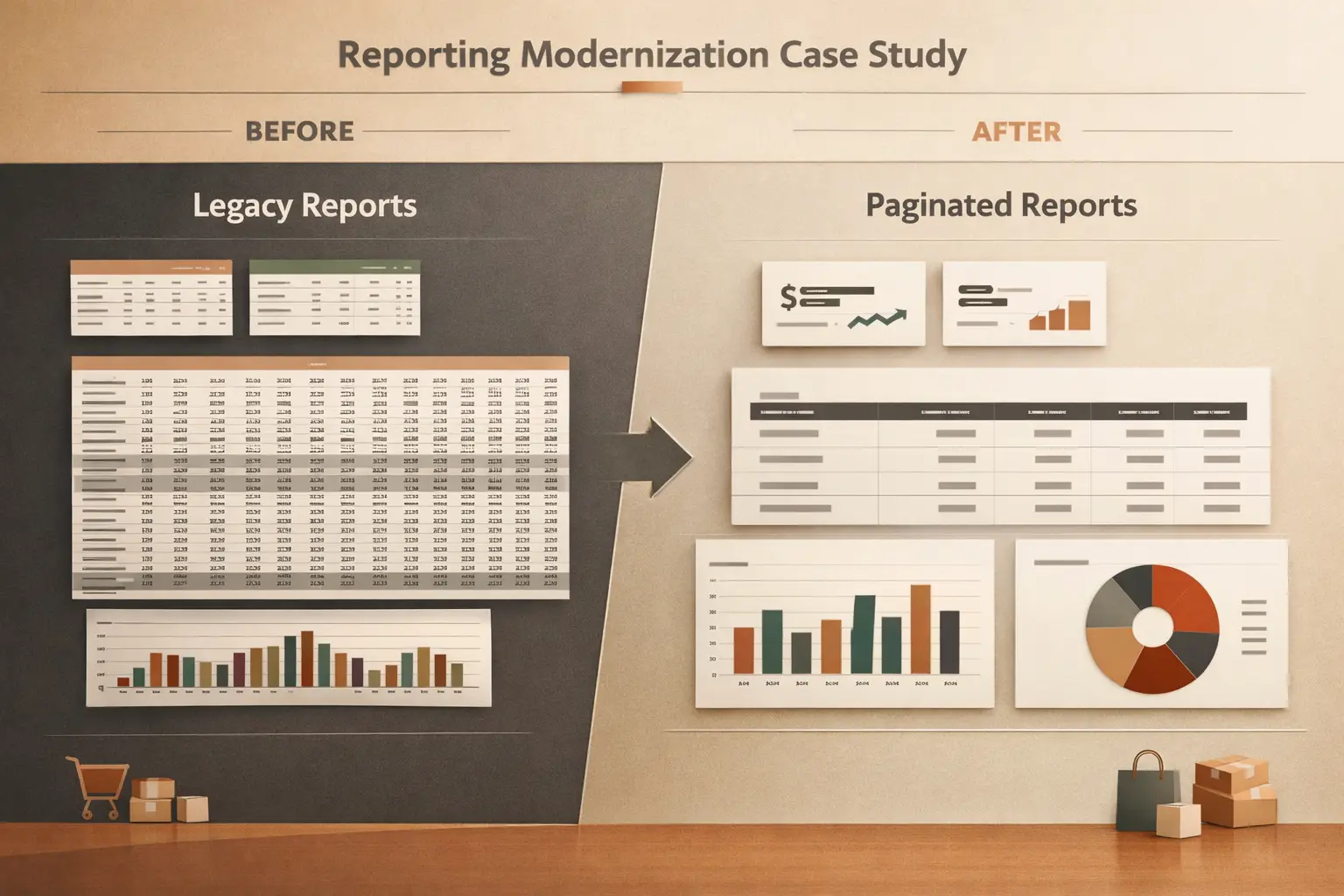
Not every report that works is a report that holds up. Some reports ship, get used daily, and still carry structural problems that make every future change harder than it should be.
A structural review is not about finding wrong numbers. It is about checking whether the report is built in a way that can absorb change, stay trustworthy, and remain usable as the business evolves.
Here are five signs that a report has outgrown its original structure.
1. Small changes require touching multiple pages
When a single business logic change — like a new customer segment or a revised KPI definition — forces edits across three or more report pages, the report likely has duplicated logic.
This happens when measures or visual-level filters are copy-pasted across pages instead of being centralized. The fix is not to be more careful with edits. The fix is to centralize the logic so changes propagate from one place.
What to check: Look at any measure used on more than one page. If the same calculation appears with slight variations, that is a structural issue, not a cosmetic one.
2. Stakeholders keep asking what the numbers mean
If consumers regularly ask “what does this number include?” or “why does this not match the other report?”, the report is not self-explanatory enough.
This is usually a design problem, not a data problem. Common causes:
- Titles and subtitles that describe the visual type (“Bar chart of revenue”) instead of the business question it answers.
- Missing context: no date range label, no filter summary, no definition footnote.
- Ambiguous totals that aggregate across dimensions they should not.
What to check: Show the report to someone unfamiliar with it. If they cannot describe what each page answers within 15 seconds, the structure is working against usability.
3. Performance degrades as more visuals are added
When a report starts fast and slows down as pages and visuals accumulate, the problem is rarely the new visuals themselves. It is usually the underlying query pattern.
Common structural causes:
- Too many visuals on one page, each issuing separate queries against the same model.
- Visuals that rely on high-cardinality columns without proper summarization.
- Implicit measures or visual-level calculations that bypass the semantic model.
What to check: Use Performance Analyzer on the slowest page. If more than half the visuals take over 500ms, the page layout or the visual-to-query ratio is the issue — not a single slow measure.
4. The report cannot support a new slicer without breaking something
Adding a slicer should be straightforward. If a new slicer causes existing visuals to return unexpected results, blanks, or errors, the model-report contract is fragile.
This often indicates:
- Relationships that do not propagate filters as expected.
- Measures that use
ALLEXCEPT,REMOVEFILTERS, orCALCULATEoverrides that conflict with the new slicer context. - Visuals that depend on a specific filter state that the new slicer disrupts.
What to check: Before adding a new slicer, test the affected measures in a DAX query with the new filter context applied. If the results are surprising, the issue is in the model or the measure, not in the slicer.
5. No one wants to own the report
This is the clearest signal. When a report has no clear owner, or when the person who built it avoids making changes, the report has likely accumulated enough structural debt that maintenance feels risky.
Common patterns:
- The original author left and no one fully understands the report’s logic.
- There is no documentation for which measures map to which business definitions.
- Changes are avoided because “it might break something.”
What to check: Ask the current maintainer how confident they feel making a change to the most-used page. If the answer involves “I would need to test everything first,” the report needs a structural review, not just a bug fix.
What a structural review actually involves
A proper structural review is not a full rebuild. It is a focused assessment:
- Map the report’s logic flow. Which measures power which visuals? Where is logic duplicated?
- Check the model-report contract. Do all visuals respect the intended filter context? Are there hidden overrides?
- Assess maintainability. Can a new team member understand the report structure within an hour?
- Identify the highest-risk areas. Which pages or visuals are most likely to break on the next change?
The goal is a clear picture of what needs to change and what can stay — before the next request arrives and forces a rushed fix.